Editing modes
When using the CMS, there are two editing modes available, which can be accessed from the CMS header using these icons: 
- The content mode
- When this mode is activated, the icon turns orange

- This mode allows you to modify the whole website: texts, images, logos, buttons, etc...
- You can access this mode by clicking on the editing pencils that appear when you hover over any editable content

- When this mode is activated, the icon turns orange
- The text mode:
- When this mode is activated, the icon turns orange

- This mode allows you to modify all the texts of the website directly in the page
- When this mode is activated, the icon turns orange
Editing menus
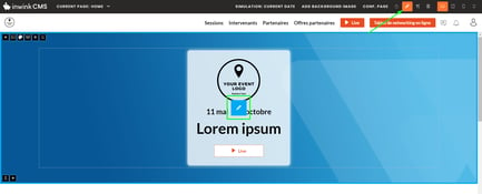
To edit a menu, when hovering over the menu, click on the editing pencil  :
:

Menus content
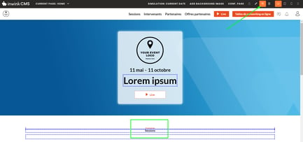
Click on the edition button that appears over the menu you intend to edit:
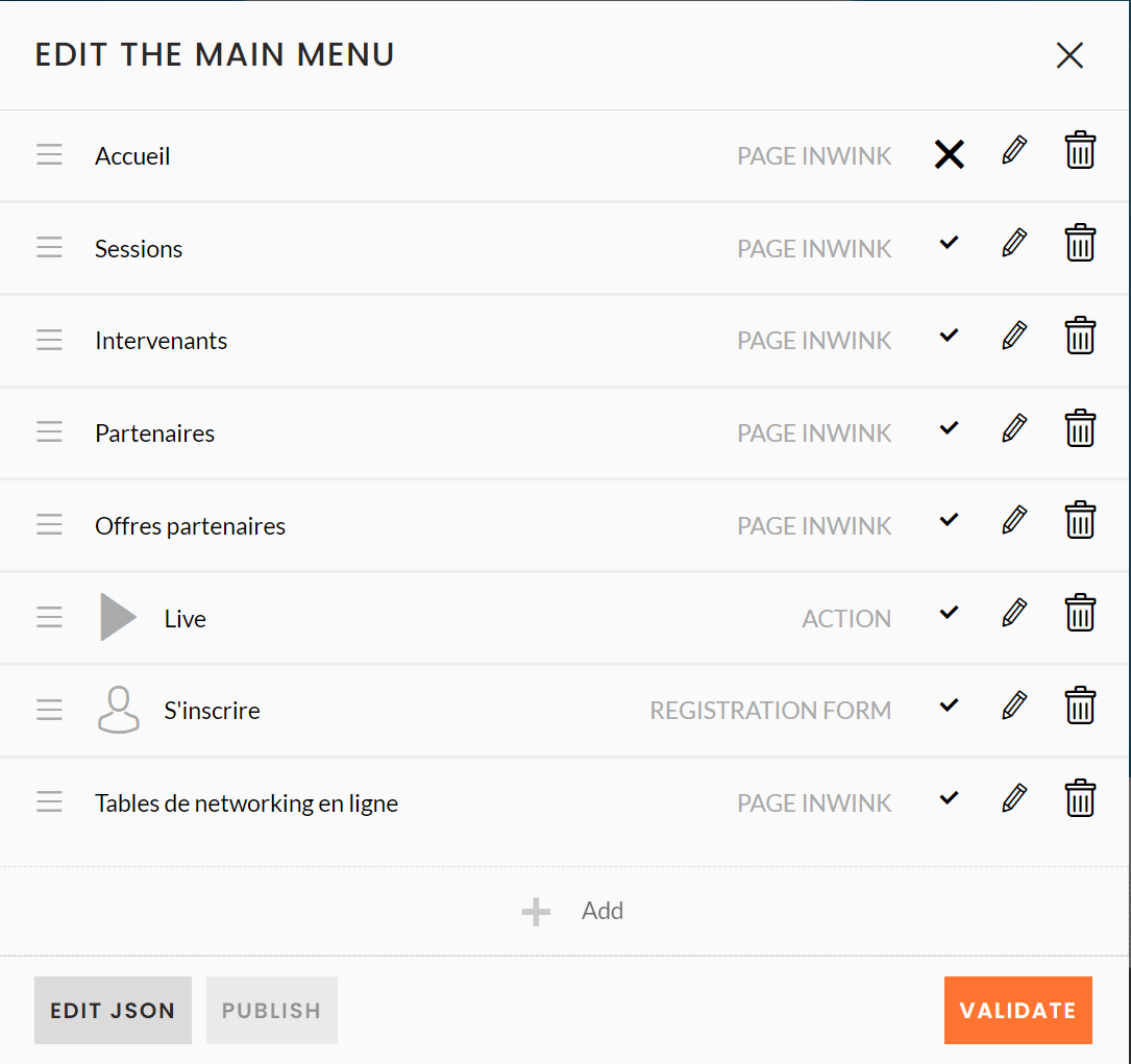
- Add an item: Click on + ADD at the bottom of the menu edition window. The item configuration window appears.
- Edit a menu item: On the right side of menu items click on
 . The item configuration window appears.
 - Disable a menu item: On the right side of menu items click on
 . The item will disappear in the preview website, but you can activate it again by clicking on
  .
. - Remove a menu item: On the right side of menu items click on
 .
. - Move a menu item: To the left of the item, drag it to move it with the
 button
Add a sub-menu
You can also add a sub-menu by dragging an item under another item so that it becomes a sub-menu when you edit your menu bar
.png)
You will have a sub-menu in your menu bar :
.PNG)
Editing an item in the menu
When you add or edit a menu item, the item configuration window appears:
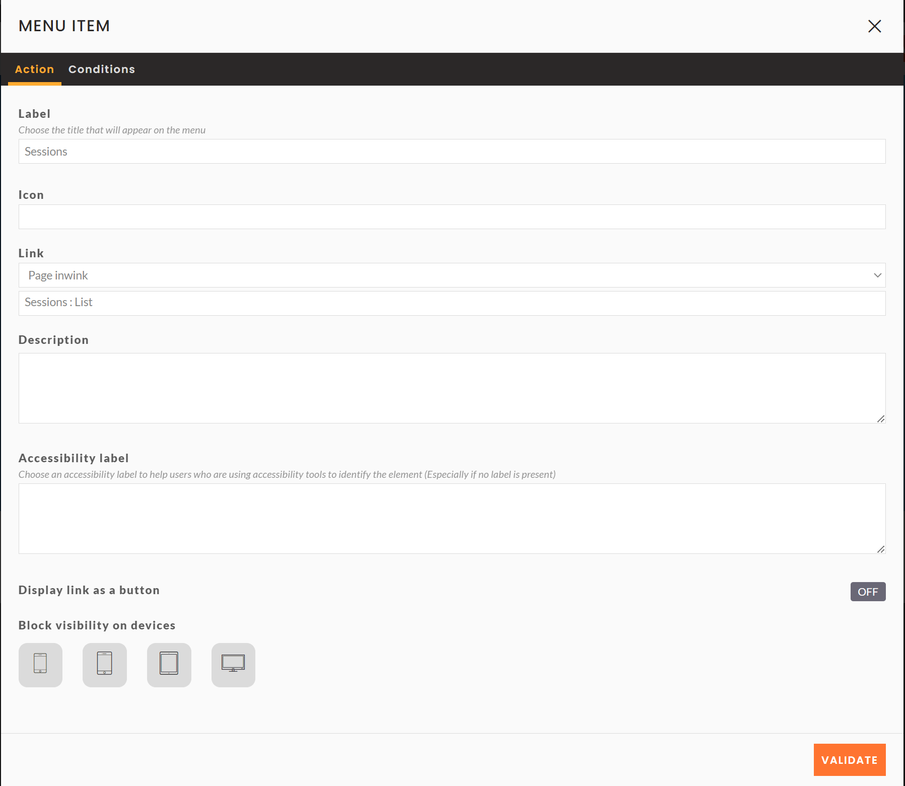
Action tab :
- Label: name of the item that will be displayed on the website
- Icon: add an icon next to the item nam
- Link: type of link to add :
- No link: no link added to the item
- inwink page: link to a page of the event website
- If the page is a detail page, you have to choose the specific page to add
- File: link to a document loaded in the inwink file manager
- URL: link to an external page
- Actions: allows users to log in / out or add the event to their calendar
- Share on social networks: share the website on social networks
- Email address: send an email to a specific email address
- Anchor: link to a specific block in a page
- Description: item description
- Accessibility label: label used for accessibility
- Display link as a button: display the link as a button
- Block visibility by device type: the block will only be visible on the device selected (from the 4 available). By default, if no device is selected, the block will be displayed on all devices.
Burger menu appearance
When your screen goes below 1023 pixels, a burger menu appears with all the information from the menu bar
.png)
.png)
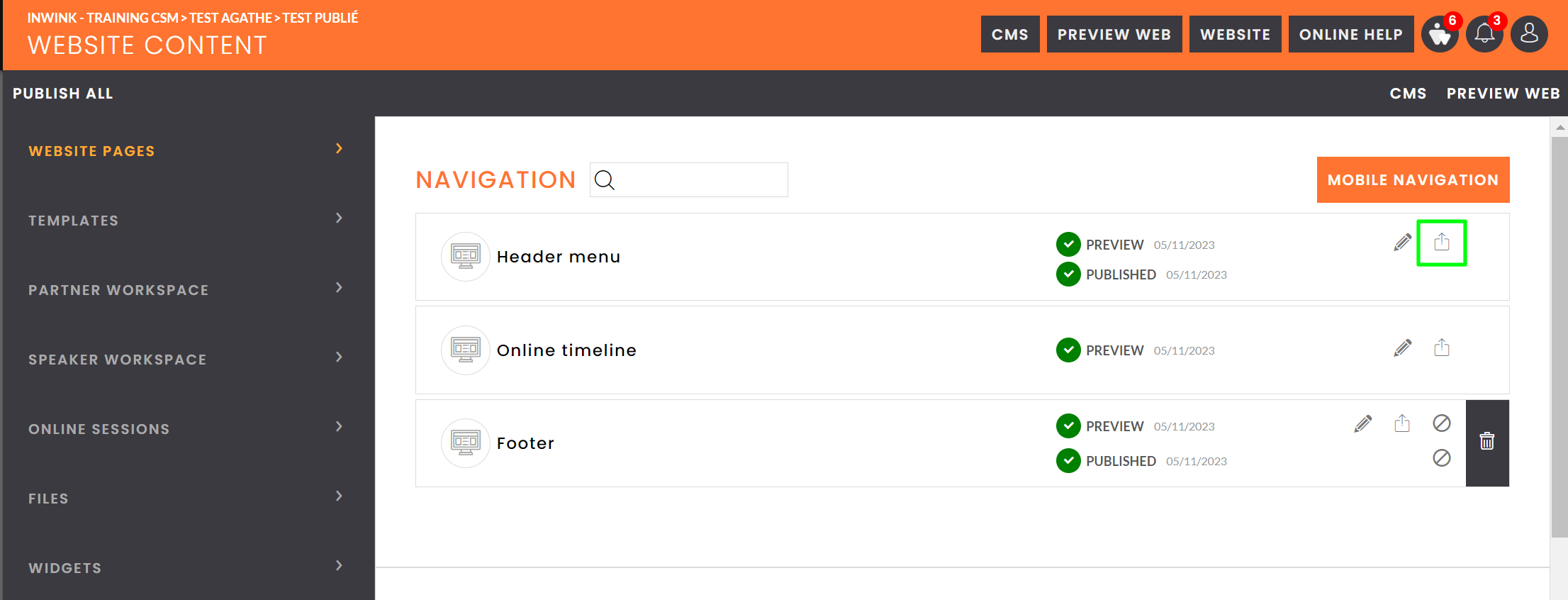
Publish the menu
To publish a menu, go to WEBSITE / Site content / Websites pages, click on  next the the preview version of the menu you want to publish.
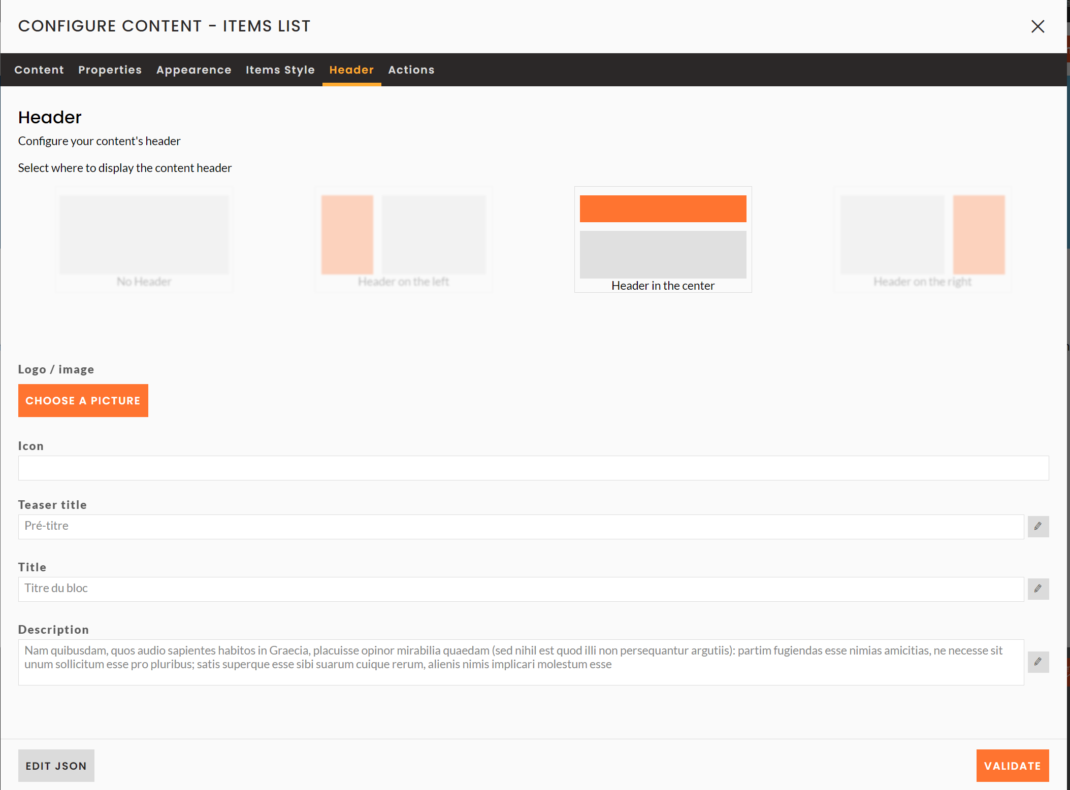
Block header edition and block actions
Almost all blocks in inwink have these to configuration tabs :
- Header: this tab allows you to define the text, the image and the position of the header (title, pretitle and description) in relation to the content of the block, as well as its size.
- Actions : this tab allows you to manage and add action buttons on the headers of your blocks.
Editing a content block
To edit a content block:
- Click on the pencil to edit a block

- Modify texts, images, icons or action buttons in the block
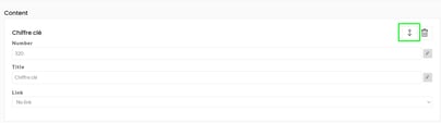
- For blocks of the types Item List, Key Figures, Text on several columns, etc.., you sort the itemps with the arrows and and add items at the bottom of the pop up.
- For blocks of the types Item List, Key Figures, Text on several columns, etc.., you sort the itemps with the arrows and and add items at the bottom of the pop up.
- Click on VALIDATE at the bottom right to save your changes.
Event content blocks
As a reminder, the content of this type of blocks comes from the different grids in the back office. In the CMS, you'll be able to set up how this content appears.
Teaser blocks
A preview block has three specific tabs :
- Properties : this tab allows you to filter, sort and choose the display of the data of the block.
- Appearance : this tab allows you to choose and adapt the columns according to different screen sizes.
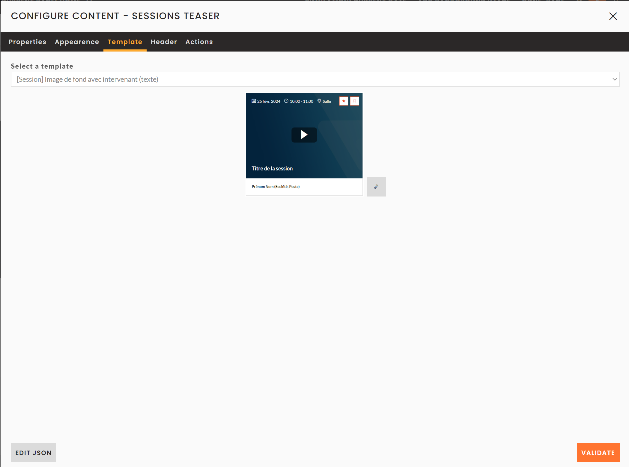
- Template: if several templates have been defined for an entity (e.g. partner), you can choose the template the block will use in this tab.
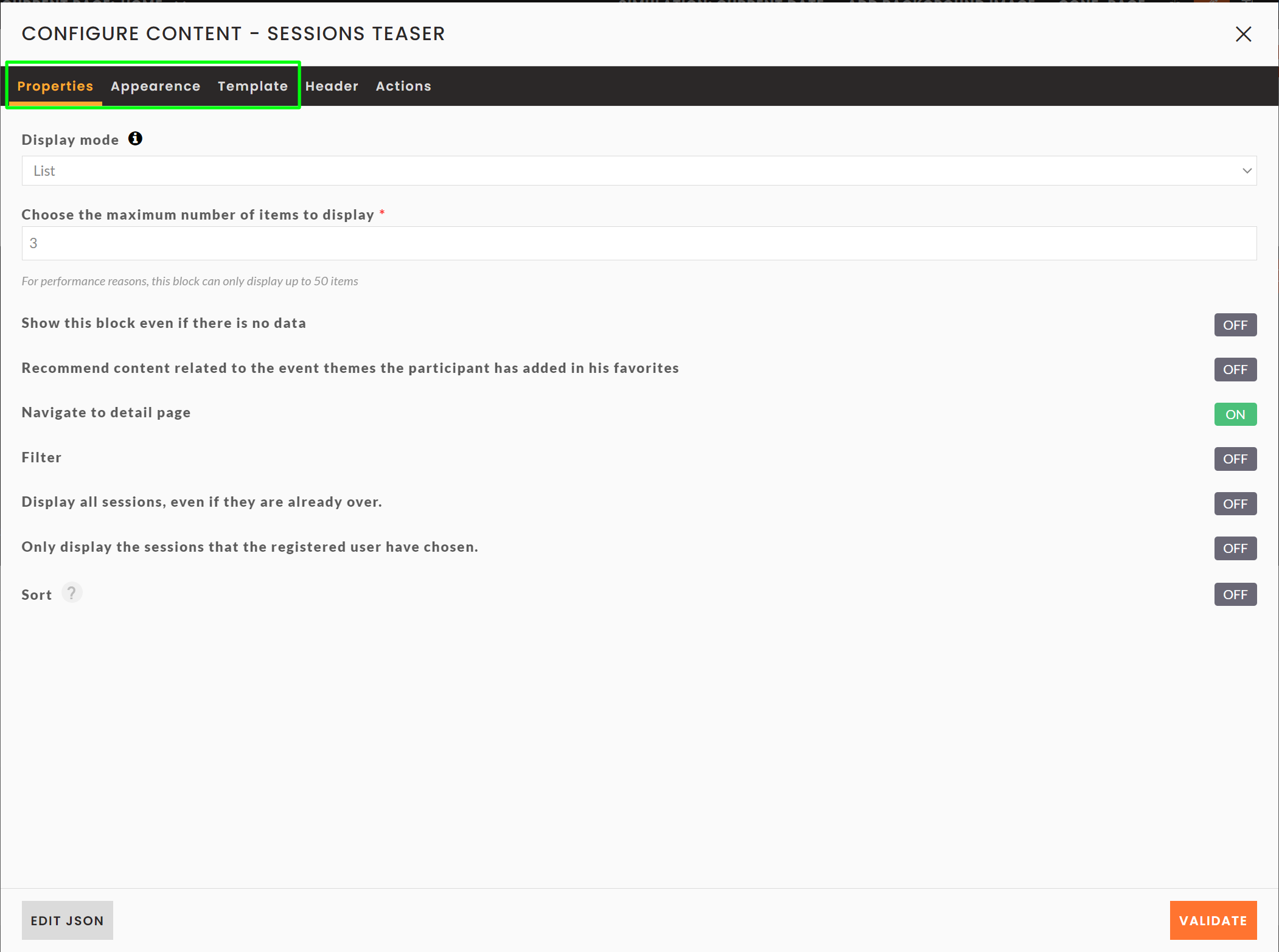
Properties tab
In this tab, you can change the following settings :
- Display mode : you can display items in list or carousel.
⚠️ The carousel mode only works with 6+ items to display. - Choose the maximum number of items to display : this option allows you to limit the number of elements to display in your block.
- Show this bloc even if there is no data : this option allows you to display the block even if there are no items to display.
- Recommend content based on the themes of the event bookmarked by the participant : to be developed
- Navigate to detail page : activate or deactivate the redirection to the relevant detail page when a user clicks on an item.
- Filter: This option allows you to filter the items to be displayed according to one or more fields.
- Sort: By default, the items are displayed in random order. You can choose to sort them according to a specific field in ascending/descending order.
On session preview blocks only, you also have the following settings :
- Show only sessions that the active user has signed up for Show only sessions that the active user has signed up for
- If the user is logged in, it is possible to display only the sessions to which the user has registered.
- Display all sessions, even those that have already taken place
- You can choose to display only upcoming sessions, such as during the event.
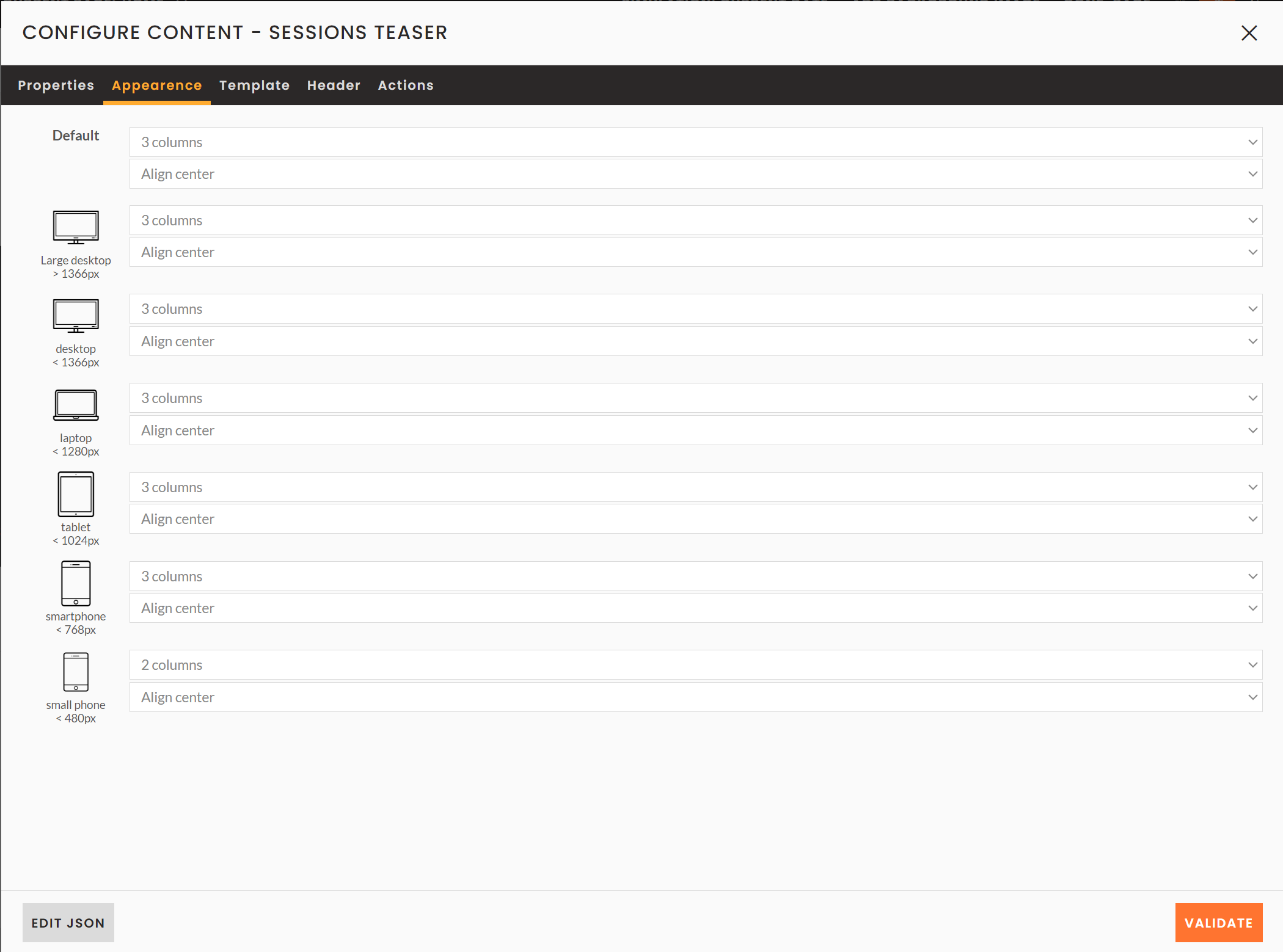
Appearance tab
In this tab, you can set the number of items to be displayed per line according to the width of the screen, as well as their alignment.
For example here, for any screen with a width resolution greater than 1366px, 5 items per line will be displayed.
The more the screen size decreases, the more the number of columns decreases.
These items are centered in the page.
⚠️ It is strongly advised to always set the appearance parameters.
Template tab
In this tab, you can choose the template you want to use to display your items, and thus their appearance.
List blocks
A list block has seven specific tabs :
- General : this tab allows the basic setting of the block.
- Appearance : this tab allows you to choose and adapt the columns according to the screen sizes.
- Template: if several templates have been defined for an entity (e.g. partner), you can choose the template to be taken into account in this tab.
- Search : this tab allows you to add and configure a search field.
- Filters: this tab allows you to add filters on your page so that your users can filter the list of data.
- Groups : this tab allows you to configure the display of your list by grouping items according to a field.
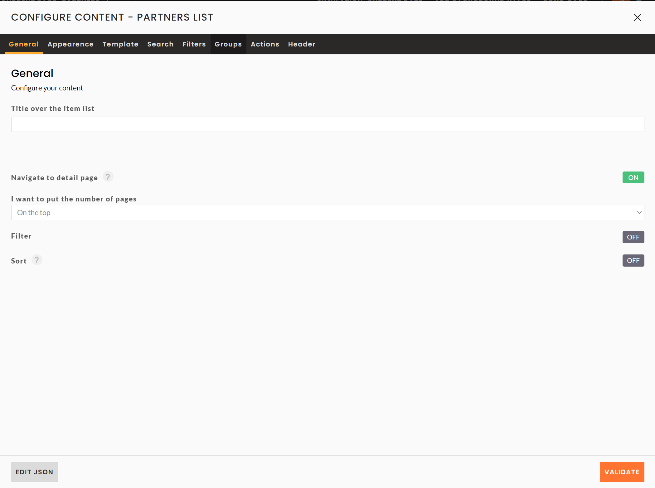
General tab
In this tab you can add the following settings :
- Title over the item list: you can add a title that will appear above the list of items and filters, especially in mobile view, where the title and the description of the list blocks disappear.
- Navigate to detail page: Enable or disable the redirection to the relevant detail page when a user clicks on an item.
- I want to indicate the number of pages : a list of items can contain a maximum of 40 items on the same page. Beyond that, inwink adds a pagination system. You can then define, thanks to this option, if you want to display the page numbers at the top, at the bottom, or at the top and bottom of the item list. This last option is the most recommended, because it gives the user an immediate idea of the number of items to skim through.
- Filter
- Sort
Appearance tab
The Appearance tab of the list blocks works like that of the teaser blocks.
Template tab
The Template tab of the list blocks works like that of the teaser blocks.
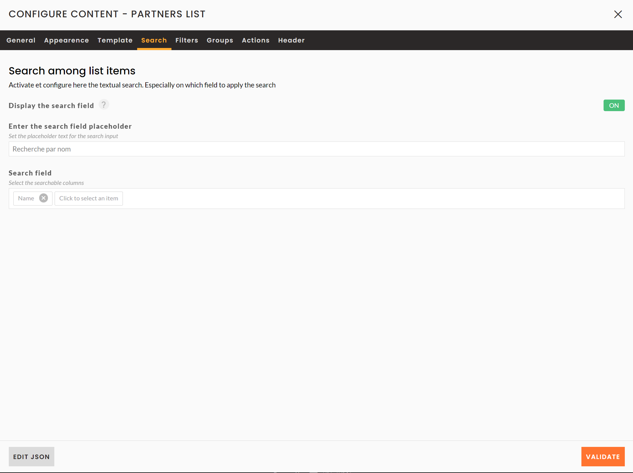
Search tab
In this tab you can add the following settings :
- Display the search field : this option allows you to activate or not the search for items in the list.
- Enter the search field placeholder: this option allows you to modify the default text inside the search field when no search is entered.
- Search field : this option allows you to select the fields concerned by the search. For example, here, when someone enters a word in the search field, the search will be performed on the partners' names.
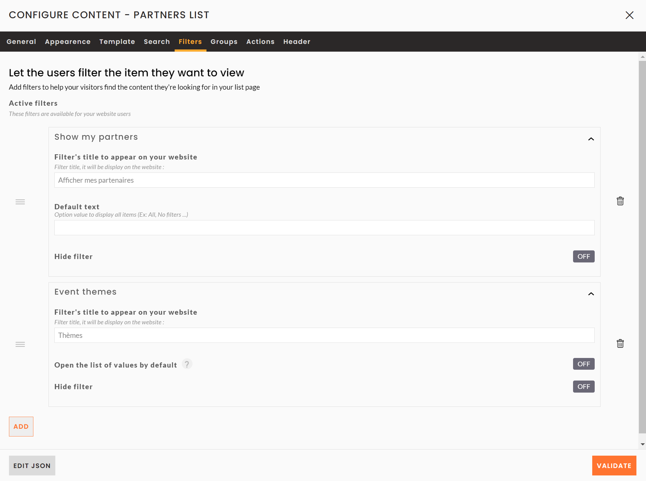
Filters tab
To add filters to your list :
- Click on the button ADD
- Choose the field that will filter your list
- Then click on the chevron
 to the right of your field to get the following options
- Filter's title to appear on your website : this option allows you to change the display title of your filter
- Default Text : This option allows you to set the default text to be displayed when no option is selected.
- Open the list of values by default : this option allows you to display all the available options without the user having to scroll down the list of the latter.
- Hide filter : this option allows you to hide the filter, in case you want to display it later, without deleting it by clicking on the trash can on the right of the window.
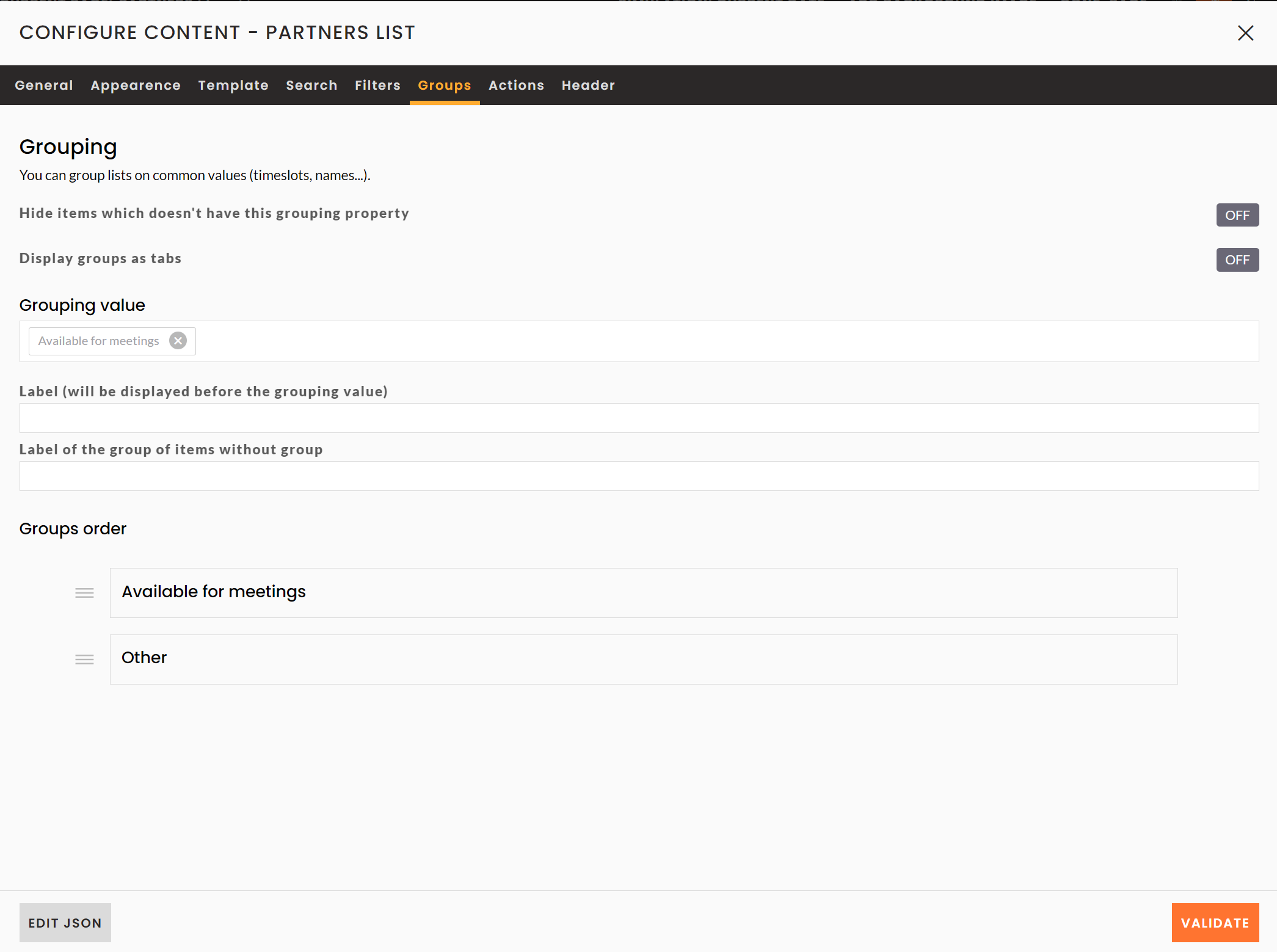
Groups tab
This tab enables you to set up groups of items according to defined properties. You can only select one grouping property per block.
You then have the following display options:
- Hide items which doesn't have this grouping property : it is possible that for some items the grouping property is not filled in. This option allows you to hide them.
- Show groups as tabs : this option allows you to show groups as tabs.
- Grouping Value: This field allows you to indicate which grouping value you wish to use. Only Single Choice, Multiple Choice and Boolean fields are available. There can only be one grouping value on the same list block.
- Label : this field allows you to display a title above the group titles on your block.
- Label of the group of items without group: This option allows you to customize the group heading for items for which the grouping value you have selected is not specified. By default, these are grouped in a Other group.
- Order groups : rearrange the order of the groups using drag & drop.
Display parameters of a block
You can find the diplay parameters of a block by clicking on the  button on the top left side of the block while mousing over it.
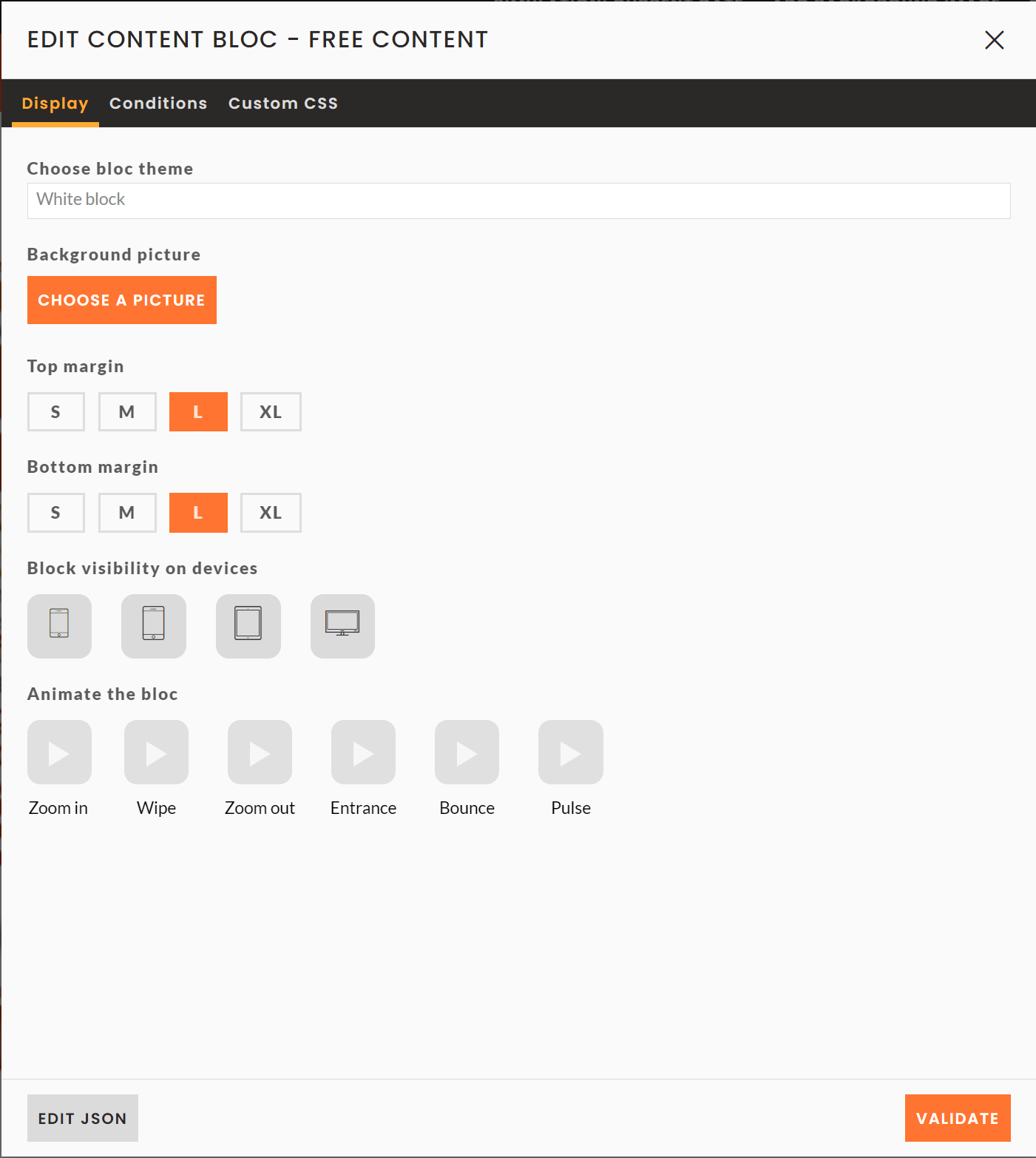
Appearance tab
Choose here :
- The display theme used for this block
- The background image you can add to the block
- Increase the top and bottom margins of this block
- Select the devices where the block will appear (if none is selected here, then the block will be visible on all devices)
- Animate the block with the proposed options
Display conditions tab :
Here you can:
- Disable block: this option allows you not to display a block without deleting it. This allows you, for example, to prepare your site for the post event in advance.
- Select the users who can see this content: select the users who can see this block according to a user's login and/or registration status: logged in, not logged in, logged in and registered, etc.
- Display block by date: choose when you want to display this block on your site (all the time, before or after the event, on customized dates, etc.).
- Show content if: set a display condition for this block by choosing the field and condition to be taken into account for the display of your block ➡️ For a preview of your site according to dates, please refer to the simulation.