
Since October 30, 2026, a new badge engine is available in inwink, along with a visual editor that makes it easier to create and customize your badge templates.
Add text, QR codes or images, adjust how they look and move elements directly on your badge with drag and drop.
This new engine applies to all new badge templates created from the gallery. Templates created before October 30, 2026 remain unchanged and keep working as before.
1. Create a new badge template
To get started, go to your badge templates in your event's back-office (Onsite tab > Badge templates):
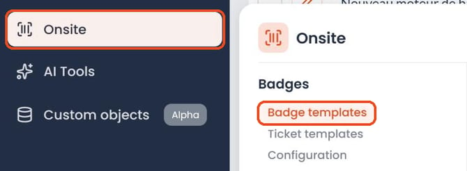
- Create a new badge template.
- Select a template from the gallery.
- Name your template.
- Click "Edit template content" to open the new editor.
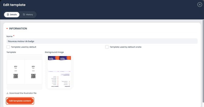
You can also set this template as:
- the default template ("Template used by default" checkbox)
- the default onsite template ("Template used by default onsite" checkbox)
From this screen, you can also add a background image to your badge (Background image area) or download the template's Illustrator file ("Download the Illustrator file" link) to prepare your background at the right size.
2. Get to know the badge editor
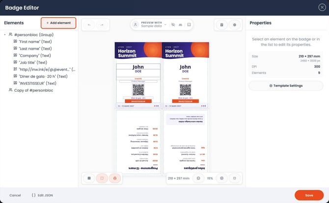
The new editor lets you view and customize your badge directly in your browser.
The interface is made up of several areas:
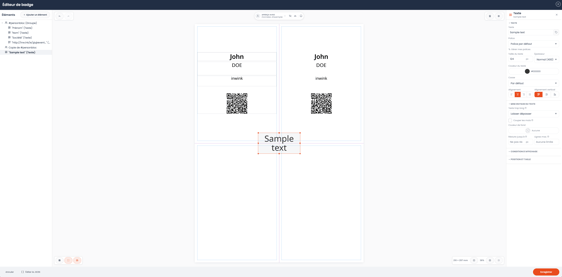
- On the left: the list of elements on your badge (texts, QR codes, images, groups).
- In the center: a visual preview of the badge, where you can select and move elements.
- On the right: a Properties panel that opens when you select an element, so you can customize it. While no element is selected, it shows the badge size (in millimeters and pixels) and its resolution (DPI).
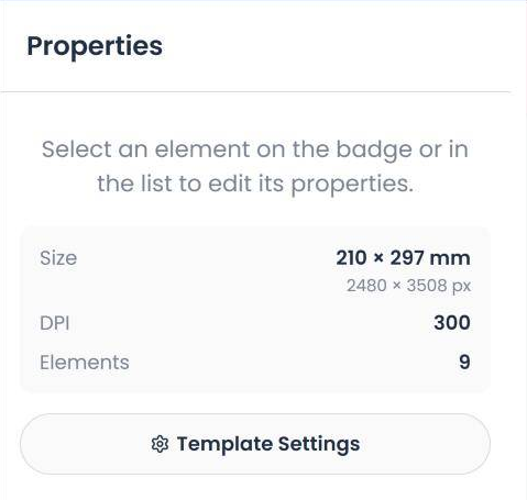
You can move elements directly on the badge with drag and drop to adjust their position. To go back, use Undo (Ctrl+Z); to redo an undone action, use Redo (Ctrl+Shift+Z).
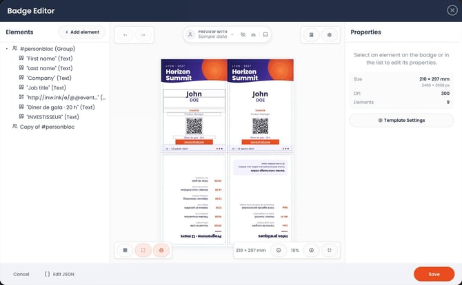
Below the preview, several buttons help you work on the layout:

- Show grid: displays a grid to align your elements.
- Show element outlines: shows the frame of each element, useful to spot text areas.
- Show print guides (folds, margins): shows the fold lines and the safety margins to respect.
- Zoom out, Zoom in and Fit to view: set the preview zoom. The badge size is shown next to them (for example 210 × 297 mm for an A4).
At the top right of the editor, two buttons give you access to your badge template's general settings.
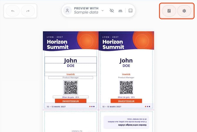
- Background image: click the first icon to add a background image that applies to the whole badge. This is especially useful to bring in your brand identity or a custom visual.
- Template Settings: click the gear icon to access your badge template's general settings.
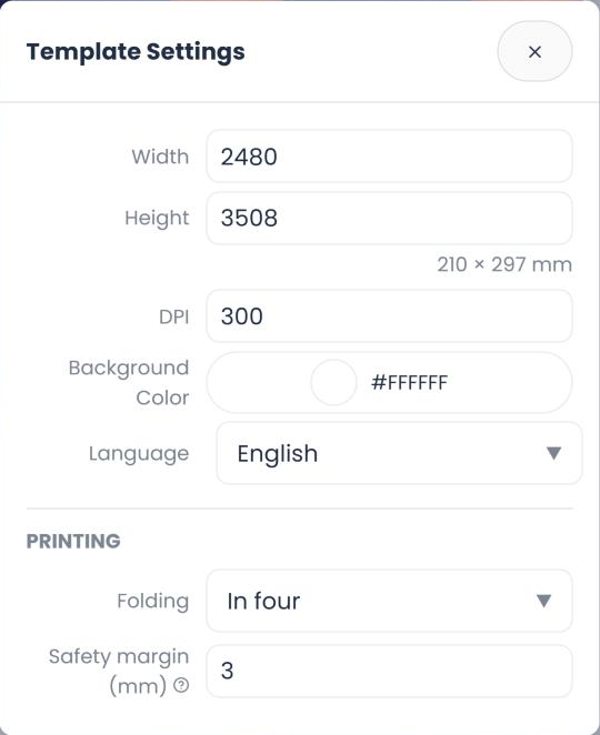
Template Settings include:
| Setting | What it defines |
|---|---|
| Width / Height | Badge size in pixels, with the equivalent in millimeters (210 × 297 mm for an A4) |
| DPI | Print resolution (300 on an A4 template) |
| Background Color | Color under the background image (white by default) |
| Language | Badge language (for example English) |
| Folding (Printing section) | None, In half, across; In half, down; or In four |
| Safety margin (Printing section) | The strip to keep clear along the edges and folds, since the cut or fold may land slightly off |
Then display the print guides on the preview to check that your texts and QR codes stay inside the margins.
These options let you customize your template as a whole, independently of the text, image or QR code elements you add next.
3. Add elements to your badge
To build out your template, click "+ Add element" in the left panel.
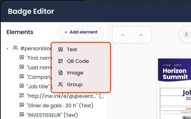
Four types of elements are available:
- Text: add free text or dynamic information, such as an attendee's first name, last name or company.
- QR Code: add a QR code containing a specific value or data.
- Image: add a graphic element to your badge.
- Group: group several elements together to organize them more easily and rotate them as a whole.
Each element you add appears in the list on the left, where you can select and configure it individually. In this list, you can also:
- change the order of elements with Move up and Move down
- remove an element with the Delete cross
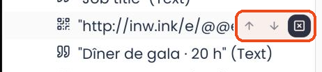
- for a group, add an element inside it with Add child element, or duplicate it with Clone.

4. Customize your badge elements
When you select an element, its settings panel opens on the right of the screen.
The available settings depend on the type of element.
Add and customize text
The "Text" element displays content on your badge, whether fixed text or information from your event data.
You can configure:
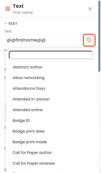
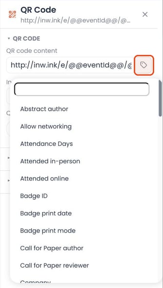
- The text content: type your text or insert a dynamic value. Use the icon to the right of the Text field ("Insert a field") to insert dynamic data. This automatically pulls information about the attendee or their registration, such as their first name, last name, company or other fields available in the event (including custom fields you have already created). Dynamic data is shown between @@ (for example @@firstname@@ for the first name).
- The font: select a font and manage your available fonts ("Manage my fonts" link; "Default font" by default).
- Text size and weight: adjust the text size in pixels and its weight (from Thin (100) to Black (900)).
- Text color: customize the color of the text.
- Case: set how upper and lower case are displayed (Default, Uppercase, Lowercase, Capitalize each word or Capitalize first letter).
- Alignment: choose the horizontal alignment (Left, Center, Right, Justify) and the vertical alignment (Top, Center, Bottom) of the text.
The "Text layout" section also lets you handle texts that are too long.
You can set how they behave (Text too long: Let it overflow, Cut or Cut with "…"), allow word breaks or not (Break words), apply a background color, set a minimum size the text can shrink to (Shrink down to) or limit the number of lines (Max. lines; No limit by default).
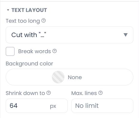
These options are particularly useful when attendee information varies in length, for example company names.
Add and configure a QR Code
The QR Code element lets you add a code directly to your badge.
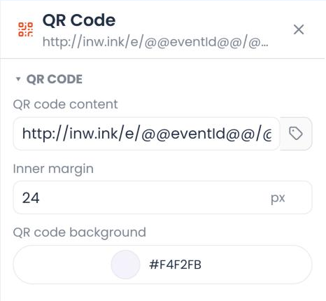
From its settings panel, you can set:
- QR code content: a URL, a value or dynamic data ("Insert a field" button)
- Inner margin: the space around the QR code, in pixels
- QR code background: the background color (white, #FFFFFF, by default)
You can also adjust its position and size on the badge.
Add an image
The "Image" element lets you add a visual to your badge template.
Once the element is added:
- Click "Choose an image"
- Select the visual you want
- Adjust its position and size
A "Full page" option is also available to fit the image to the badge surface.
More settings are available in the Advanced section.
Organize elements with groups
The Group element brings several elements together in a single set (for example the attendee's first name, last name, company and QR code).
You can set the group rotation to adapt the orientation of its content (0°, 90°, 180° or 270°).
This is useful when several pieces of information need to be organized together on the badge.
Duplicate a group with Clone
The Clone button creates a copy of a group (for example "Copy of #personbloc").
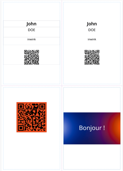
This is useful for a folded badge: the attendee's information then appears on each visible side.
In the copy's panel, you can:
- place the copy wherever you want (X and Y position), independently of the original group
- choose its rotation: same as the source group, or 0°, 90°, 180°, 270° (handy for a side that will be turned over when folded)
- find the original group it was cloned from. Example: on an A4 badge folded in four, the "personbloc" group is placed on one quarter of the page and its copy on the next quarter.
5. Adjust the position and size of elements
To lay out your badge, select an element directly in the central preview and move it where you want with drag and drop.
Each type of element also has a "Position and size" section in its settings panel. There you can set, down to the pixel:
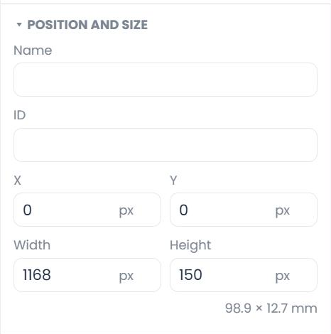
- the element Name, so you can find it easily in the list
- its horizontal (X) and vertical (Y) position, from the top left corner of the badge
- its Width and Height, in pixels. The equivalent in millimeters is shown below (for example 98.9 × 12.7 mm), handy when thinking in print format
This way, you can fine-tune the layout of your content to get the result you want.
6. Set display conditions for your badge elements
The new editor lets you show or hide badge elements based on each attendee's registrations and information.
The goal: use a single badge template while only showing the information relevant to each person.
For example:
- For an event followed by a dinner: if the attendee is registered for both the event and the dinner, their table number appears on their badge, with the label "Table". If they are not attending the dinner, neither the label nor the table number is shown.
- For a networking workshop: if the attendee is registered for the workshop, the related information appears on their badge. Otherwise, this information is hidden, including its label.
How to set up a display condition?
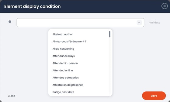
- In the editor, select the element (text, QR code, image or group)
- In the settings panel on the right, open the "Display condition" section. It reminds you that the element is only displayed when the condition is met.
- Click "Set the condition", then define the condition based on the attendee's information or registrations
- Check your badge with Preview with display conditions
Tip: use a group to bring a label and its value together (for example "Table" and "12"), then apply a display condition to the whole group. Both elements then appear or disappear together.
This way, a single badge template automatically adapts to your attendees' different profiles and registrations, without multiplying templates.
7. Preview your badge before using it
Once your badge is customized, you can preview it directly from the editor to check how the information is displayed and where the elements are placed.

Several preview options are available in the bar at the top of the editor:
- Preview with sample data: see your badge with the information of an attendee registered for your event, for a concrete view of the result. By default, the button shows "Preview with: Sample data" (dummy data); click it ("Choose a person for the preview") to select a registered attendee.
- Preview with display conditions: check which elements are shown or hidden based on the conditions you have set up.
- Test with long texts: test how your badge behaves when some information, such as a name or company, is particularly long. This lets you check that texts stay readable and don't overflow their areas.
If this bar gets in your way, you can move it with the "Move the preview bar to the bottom" button.
These modes let you check how your template renders and adjust its layout before using it for your attendees.
When you're happy with it, click Save at the bottom of the editor (or Cancel to discard your changes).
8. Use your badges with the new editor
The new badge engine is used automatically for all new templates created from the gallery.
It works at several levels:
- In the inwink back-office: when generating and opening a badge, and when exporting in ZIP or PDF format.
- In the Onsite app: to generate badges on site.
For a template to apply automatically, check Template used by default and/or Template used by default onsite in its panel (see part 1). You can find past changes at any time in the template's History tab.
Important: badge templates created before the new engine was released remain unchanged. They keep working with their existing configuration.