
The Visual identity section allows you to customize the appearance of your mobile app.
It is divided into four tabs, which we recommend going through in this order:
- General: define the foundations of your visual identity
- Color scheme: apply your colors across the entire app
- Modules: customize specific elements in more detail
- Icons: choose the icons used throughout the app
1. Configure the general settings
The General tab allows you to define the main visual elements of your app.
There are three sections to configure:
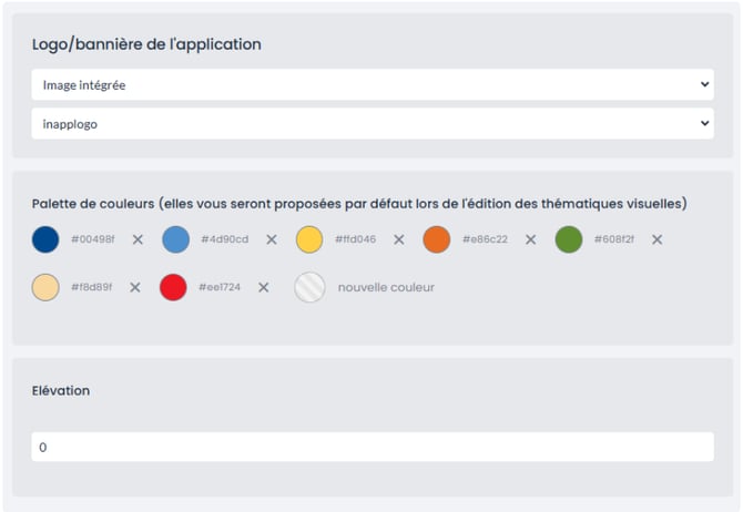
App logo / banner
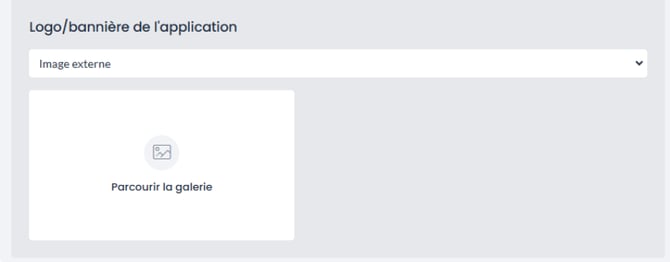
Start by choosing the type of image you want to use:
- Built-in image: select a logo that is already available in your workspace. A second dropdown menu will appear, allowing you to choose the logo you want to use.
- External image: use another image by clicking Browse gallery, then select your file.
Color palette
The color palette brings together the colors you want to use throughout your app.
To add a color, click New color at the end of the list. To remove one, click the cross next to it.
The colors saved here are not automatically applied to the app. They will then be available when configuring the Color scheme and Modules tabs.
➡️ In other words, you prepare your palette here, then decide where each color should be applied.
Elevation
Elevation allows you to define the level of depth of the different elements displayed in the app.
Enter a number in the dedicated field:
- a value of 0 gives a completely flat appearance;
- the higher the value, the more pronounced the shadow underneath cards and content blocks will be.
For example, imagine sheets of paper placed on a table: a flat sheet blends into the background, while a raised sheet casts a shadow and stands out from the rest.
This setting can therefore help distinguish certain elements more clearly from the app background.
Save and publish
Once you have finished configuring your settings:
- click Save in the top-right corner to save your changes and view them in preview mode;
- once you are happy with the result, click Publish in the top-left corner to make them visible in the live app.
2. Define the color scheme
The Color scheme tab allows you to apply colors globally across the app.
The colors defined here are used by default throughout the application. You do not configure each screen individually: instead, you assign colors to different roles — primary color, surface color, border color, etc. — and the app automatically applies them wherever they are used.
To customize a specific screen or element, use the Modules tab.
Apply a color
To change a color:
- locate the row corresponding to the role you want to modify;
- click the circle in the Background column for the background color, or in the Text, icons column for the color of the text and icons displayed on top of it;
- select the color you want to apply.
The colors previously added to your palette are suggested by default.
Repeat the process for each role you want to customize.
Understand the different columns
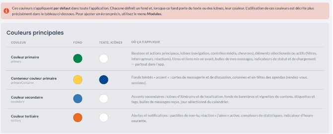
Each row in the table should be read from left to right and includes:
- Color: the name of the role, with its technical name displayed underneath (
primary,surface, etc.); - Background: the background color associated with this role;
- Text, icons: the color of the text and icons displayed on this background;
- Where it applies: the different areas of the app where this color is used.
Some colors, such as shadows or borders, do not have a Text, icons setting because no text or icons are displayed on them.
Main colors
Start by configuring the colors that make up the main visual identity of your app:
- Primary color: this is the most visible color in your app. It is used for main buttons and actions, selected elements, navigation, highlighted titles and your own message bubbles. This is usually where you should apply your main brand color.
- Primary color container: a softer variation used for tinted backgrounds, particularly in messaging cards and certain agenda elements.
- Secondary color: used for secondary accents such as location elements, banners, labels, tags and received messages.
- Tertiary color: mainly used for alerts and notifications, such as unread indicators, “like” reactions and statistic counters.
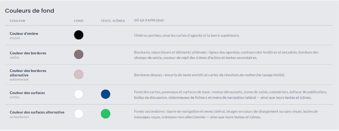
Background colors
This second table relates more to the overall structure of the app than to its visual identity. Neutral colors are generally more suitable here.
- Shadow color: the color of drop shadows, for example underneath agenda cards and the top bar. It works together with the Elevation setting configured in the General tab.
- Border color: used for lines, separators and muted elements such as window outlines, input field borders and secondary text.
- Alternative border color: a softer variation used in a limited number of places, such as rich-text areas and search result cards.
- Surface color: the background color of cards, panels, dropdown menus, input areas and calendars. This is one of the most visible backgrounds in the app, so a light and neutral color is generally recommended.
- Alternative surface color: used for secondary backgrounds such as the navigation bar, side menu, received message bubbles and unselected time slots.
Check color contrast
Make sure there is enough contrast between background colors and the text or icons displayed on top of them.
For example, white text on a light yellow background or light grey text on a white background may be difficult to read on a mobile device, especially outdoors.
A few best practices:
- pair light text with a sufficiently dark background, and vice versa;
- avoid combining two colors with a similar brightness level;
- when in doubt, use black or white for text;
- always check the result in preview mode, ideally on an actual mobile device.
💡 Tip: Do not rely solely on how the app looks on your computer screen. Some contrast and readability issues only become apparent when viewing the app on a mobile device.
Save and publish
Once your colors have been applied, click Save in the top-right corner. Your changes are saved and can be viewed in preview mode.
When you are happy with the result, click Publish in the top-left corner to make the changes visible in the live app.
3. Customize modules
Once your color scheme has been defined, the Modules tab allows you to fine-tune the appearance of specific elements within your app.
The logic is different from the previous tabs: instead of configuring a color for the entire app, you select a specific element — such as a button, message bubble or bottom navigation menu — and customize its appearance.
Choose the view to customize
Customizable elements are divided into several views:
- Bottom sheet
- Buttons
- Notification center
- Burger menu
- Tabs
- Loading page
- Chat page
- Item details page
- Item list page
- App pages
Select the view you want from the dropdown menu in the top-left corner. The preview will automatically update.
If you are not sure where to start, choose App pages: this is the main template and contains most commonly used elements.
Navigation elements such as the top bar and bottom menu are available in almost every view and can therefore be edited from several different screens.
Select the element to customize
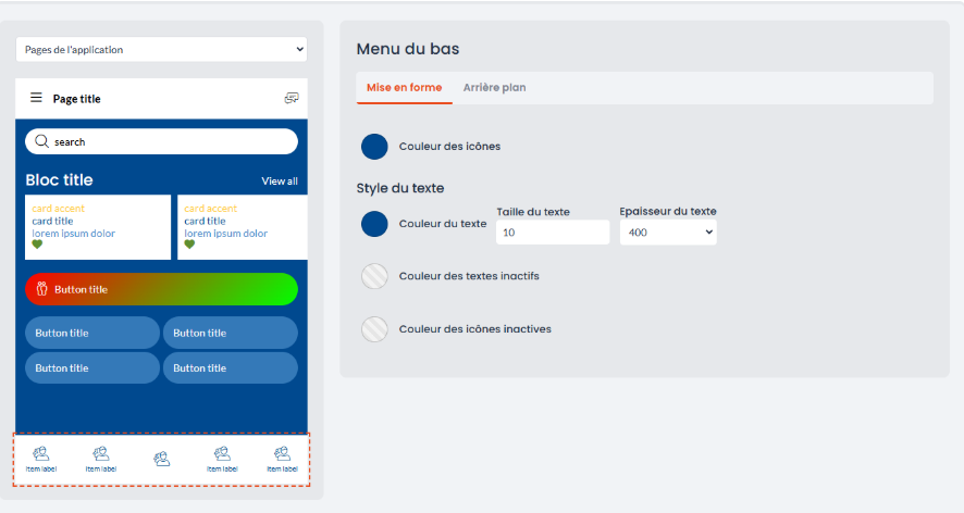
Click directly on the element you want to edit in the preview.
A dotted outline appears around it to confirm your selection, and its settings are displayed in the panel on the right.
Apply the settings
The available settings depend on the type of element selected.
For cards, you can apply one or more themes containing predefined visual settings.
For all other elements, two tabs are available:
- Formatting: icon color, text color, text size and font weight. Depending on the element, you can also define the appearance of inactive states, meaning elements that are not selected.
- Background: the background color of the selected element.
A greyed-out and crossed-out circle means that no specific color has been defined. In this case, the element uses the default color from the Color scheme.
Points to keep in mind
Some settings are shared across several views.
This applies in particular to:
- the top bar;
- the bottom menu;
- the central menu button;
- the burger menu.
As a result, changing one of these elements in one view may also change it in other screens where the same element is used.
There is one exception: the search bars displayed in the Bottom sheet and Item list page views have the same name, but they are configured separately. Changing one does not affect the other.
Save and publish
Once your modules have been customized, click Save in the top-right corner. Your changes are saved and can be viewed in preview mode.
When you are happy with the result, click Publish in the top-left corner to make them visible in the live app.
4. Customize icons
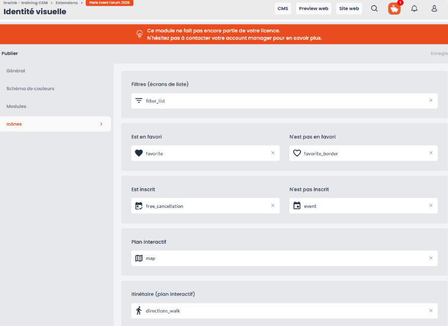
The final tab allows you to customize some of the icons used throughout the app to represent specific actions, such as adding an item to favorites, registering for a session, opening the interactive map or filtering a list.
These icons mainly appear on cards and list screens. Customizing them allows you to better match the visual style of your event.
Identify the function to customize
The available functions include:
- Filters (list screens) — the icon used to open filters in lists;
- Is a favorite / Is not a favorite — the two states of the favorite button;
- Is registered / Is not registered — the two states of the session registration button;
- Interactive map — the icon used to access the map;
- Directions (interactive map) — the icon used to calculate a route;
- Download — the icon used to download a document.
Choose the icons
Some functions have two states and therefore work as a pair, for example:
- Is a favorite / Is not a favorite
- Is registered / Is not registered
Choose icons that are different enough for users to immediately understand the current state.
For example, a filled heart and an outlined heart make it easy to distinguish whether an item has been added to favorites.
Change an icon
Click the field corresponding to the icon you want to modify to open the icon gallery.
Then use an English keyword to filter the available icons, for example:
starfor star icons;downloadfor download icons;mapfor map icons.
Select the icon you want to use.
To remove a custom icon and return to the default one, click the cross on the right-hand side of the field.
Check the result
Icons are displayed at a small size in the app, so always check how they look in preview mode before publishing your changes.
An icon that is too detailed may become difficult to recognize on a mobile screen.
Save and publish your changes
In each of the four tabs, remember to:
- click Save to save your changes and check them in preview mode;
- test how your app looks, ideally on a mobile device;
- click Publish once you have finished customizing your app.
Your changes will then be visible in the live version of your application.