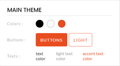 MAIN THEME : The main theme sets the default values of all custom themes. Everything you change in the default theme will also be changed in the other themes, save if you have already made these changes in the other themes.
Preferably, use this display theme to set text size, style, button angles, etc., but not colors.
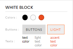 WHITE THEME: This is the display theme with a white background color.
It is advisable to keep the background color white.
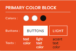 MAIN COLOR THEME: this is a display theme with the main color of your event's visual identity as the background color.
It is advisable to set the background color of the display theme to the main color of your event's visual identity.
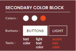 SECONDARY COLOR THEME: this is a display theme with the secondary color of your event's visual identity as the background color.
It is advisable to set the background color of the display theme to the secondary color of your event's visual identity.
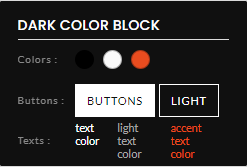 DARK THEME: This is the display theme with the darkest background color, by default black.
It is advisable to set the background color of the display theme to a dark color, even if it is not black.
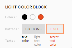 LIGHT THEME: This is the display theme with the lightest background color in your site's visual identity.
It is advisable to keep the background color very light.
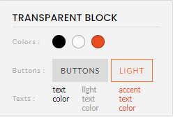 TRANSPARENT THEME: This is the block with a transparent background color, used especially when you use background images.
- Do not delete or rename these basic themes, as they are used by default in some areas of the site.
- When you change an element of a display theme, all the blocks on your site with which the display theme is associated will potentially be affected. Be sure to check that what you change for one block does not negatively affect another block.